Kitchen design in a private house - current design ideas
Owners of private houses planning to repair their kitchens are in a dual situation. On the one hand, a fairly spacious room (small-sized kitchens are rarely found in private apartments) provides an opportunity to implement various design ideas, but on the other hand, a sufficiently large space can create illusions of permissiveness, confuse the design path and create confusion in the design of the interior. Careful planning of repairs in a medium and large kitchen is no less important than drawing up a design for small spaces. It is necessary not only to plan the passage of communication systems, choose the layout of the kitchen set, determine the number of household appliances and their dimensions, but also combine all the interior elements into a single picture, give the room its own, unique character. We hope that our large-scale selection of photos of the interiors of the kitchen spaces of private houses will help you with this.
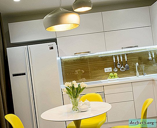

Actual ideas for decorating a kitchen in a private house
The kitchen space of a private house has its own characteristics and most often differs from the standard kitchens of apartment buildings. The following features may influence the preparation of a plan for the repair or reconstruction of a kitchen:
- the room may have an original shape (to be equipped with a bay window, for example);
- the kitchen can have several windows, and they can have a non-standard shape (panoramic, arched, vaulted and even round);
- the room may be a walk-through;
- all communication systems can be laid at your discretion;
- a pantry may adjoin the kitchen;
- the kitchen area can be part of the combined space (living room, dining room).


Of course, the overall picture of the home influences the choice of how to design a kitchen room - the style of the interior, the color palette, the ways of emphasizing. And yet, there are certain trends that designers use most often when drawing up modern kitchen space projects:
1.The influence of eco-style. All natural is now in trend. That is why the influence of eco-style can never be felt literally in all areas of life, the preparation of design projects was no exception. This is not only about the use of natural materials in the decoration and execution of furniture and decor, but also the use of a natural palette, the integration of living plants, herbaria, the use of the fruits of nature.


2.The influence of Scandinavian style. The Russians are close to the stylistics of the countries of Northern Europe, because our climatic conditions are largely similar. And who might not like the light, spacious room, designed mainly with white color with the integration of wood elements, emphasizing details with a dark background or bright accessories? Add a living plant, household items, made by yourself and dear to the heart of the little things that help create a really cozy, homely atmosphere.


3.The combination of motifs from different styles. Designers recommend taking the modern style as a basis and using elements from other styles to dilute the interior, add originality, zest. For example, contemporary style often “borrows” variations of decoration from classical trends, leaving the most innovative ideas for furnishing. Stucco molding on the ceiling or moldings on the walls are originally combined with modern household appliances and unusual, designer lamps.


4.Combination of functional zones. The combination of the living room, kitchen and dining room (and sometimes the corridor, hallway) in one space is not the prerogative of only studio apartments. In private homes, this design technique is used at least. The combination of several functional segments within the same room allows you to create a spacious, bright space even in a small area. The obvious savings in finishing and other repairs - fewer walls, doorways, doors, partitions. Not to mention the opportunity for the hostess (owner), preparing dinner, to be able to communicate with the rest of the household in the recreation area of the living room.


5.It is not surprising that designers offer us to take advantage of the location of the kitchen in a private house to benefit not only the nature of the interior, but also their own convenience, aesthetics and functionality. For example, placing a sink near a window is often an unattainable dream for housewives of small-sized kitchens in standard apartments. But in private apartments it will not be difficult to arrange the opportunity to admire the beautiful view from the window during routine kitchen processes, because communications can be transferred (if only not to the detriment of security), and there is enough space for a double sink in a medium and large kitchen.


The choice of layout of the kitchen ensemble
Not only the usability of the room, the speed and ergonomics of the kitchen processes, but also the image of the room, its appearance, largely depend on how storage systems, household appliances and work surfaces will be located. Kitchen facilities in private homes can have not only different sizes, but also shapes. Window and doorways can also be presented not in a single copy and have a different version from the standard. Therefore, the location of the working area of the kitchen can have a different arrangement and even deviation from standard options in favor of combining layouts.


Corner layout - a universal way to position a kitchen unit
The L-shaped or angular layout of the kitchen ensemble is not without reason considered the most universal. With this arrangement of storage systems, work surfaces and built-in equipment, it is possible to create the most comfortable environment for operation and rational in terms of spending usable floor space. The corner kitchen set fits organically into both the square and the rectangular shape of the room. At the same time, walls with window openings can be used, skipping the upper tier of cabinets or replacing them with open shelves.


The corner layout leaves enough free space even in a medium-sized room (9-10 square meters) for installing a spacious dining table, corner or island, which can also serve as a place for meals. For our country, the most common option is a dining table with chairs or mini chairs (depending on the size of the kitchen, the number of households, their age). Enough kitchen area of 10-12 sq m, so that you can comfortably arrange a corner kitchen set and a spacious dining group (only the room should not be too elongated, narrow).


In foreign design projects, one can often find the option of supplementing the corner layout of a furniture set with a kitchen island - a stand-alone module that combines the functions of a storage system, a cutting surface and a place for the integration of household appliances (sink, hob). The advantage of the island is also that it is easy to equip it in areas for eating, it is enough to extend the countertops for a comfortable location of 2-3 people.


A room close in shape to a square can be supplemented with a kitchen corner. Thus, almost all the walls of the room will be involved and used rationally, given the angular arrangement of the furniture set. And in the center of the room there will be enough space for a large dining table.


Parallel layout - the best option for a narrow or aisle room
For long and narrow rooms, the location of the kitchen is the best option. Walk-through rooms or kitchens with a panoramic window and access to the backyard will also benefit from a parallel layout. Having the storage systems and the built-in equipment in two rows, it is easy to follow the “working triangle” rule, placing its conditional vertices at a sufficient distance from each other and on opposite sides of the furniture ensemble.


U-shaped arrangement of the furniture ensemble in the kitchen of a private house
The location of the kitchen ensemble in the shape of the letter "P" allows you to saturate the kitchen with the maximum number of storage systems, household appliances and work surfaces. This is a great way to arrange a kitchen for a large family who need a large, roomy suite to maintain order. If the kitchen is in the shape of an elongated rectangle, then, most likely, in the center it will not be possible to establish not only a dining table, but even a narrow kitchen island. For households that provide for the allocation of a separate room for arranging a dining room or a dining area moved to the living room, this layout option will be optimal.


Linear kitchen in combination with an island or dining group
A single-row or linear kitchen set is suitable for small rooms and a small number of storage systems and household appliances or kitchens in which you need to install a spacious dining group. This layout method is often chosen if it is planned not only to arrange a place for household meals in the kitchen room, but also guests' receptions.


The linear kitchen, complemented by the island, already represents a more convenient and roomy system for carrying out the necessary work processes. In addition to the fact that the kitchen island allows you to increase the number of storage systems becomes a place for the integration of household appliances or sinks, the extension of its countertop allows you to organize a place for meals.


If there is not enough space for installing a kitchen island or a full-fledged dining group in the kitchen, you can supplement the linear set with a small peninsula, a bar counter or a console resting on one support and attached to the wall.


Actual color palette for a private home kitchen
The choice of colors for the design of the kitchen will depend on the following factors:
- the size and shape of the room;
- level of natural light - the number and scale of window openings, the location of the kitchen relative to the cardinal points;
- the color palette of the rooms adjacent to the kitchen and the general gamut of home decoration and your desire to highlight the kitchen design or organically fit into the overall picture of the home.


There are many options for choosing color solutions that will be relevant at all times. For example, if your kitchen cannot boast a large area or is located on the north side of the building (plantings, buildings or landscape design elements block sunlight from the windows), then a light palette will become the best design option. Snow-white surfaces help not only visually expand the volume of the room, but also create a light, fresh image of the interior. In addition, any other color scheme is easily combined with white color - you will not need to rack your brains about compatibility.


A completely white kitchen can cause unpleasant associations, so light surfaces must be diluted with accents. The easiest way to integrate wood surfaces into a bright kitchen image. Thus, not only the color palette of the room becomes more diverse, but the level of coziness, comfort brought by the warmth of the wood pattern increases.


Another no less effective way to add emphasis to the light design of the kitchen is a bright color scheme for the apron. The colorful shade of ceramic tiles, mosaics, glass or plastic will become a center of attraction and can distract attention from unsuccessful interior elements, if necessary.


It is even easier to bring a bright stream into the bright interior of the kitchen - to install household appliances in bright colors. Typically, such household appliances are made in retro style, but there are also appliances in a modern style, high-tech.


Facades of all shades of gray do not lose their popularity. Neutral, discreet, but at the same time noble, gray color goes well with any type of hardware (from the glitter of chrome details to a bright gilt glow), the choice of color for countertops (from snow-white to dark, almost black) and the background of the finish.


Designers recommend that those who are not confident in their ability to combine colors in decoration, furniture and decor, use the universal way to create a fun, modern and at the same time harmonious design. Use a white tone as the main one (ceiling, walls, furniture - partially or completely), wooden surfaces to dilute a light image (flooring, countertops, facades locally or for the entire headset), and a dark shade to emphasize the geometry of the room, highlighting those or other functional areas or individual items.


The spacious kitchen of a private house can afford the dark design of facades or decoration. The dark, deep color of the kitchen set gives the whole room a touch of luxury, drama and even some severity. Of course, dark facades are more difficult to care for - you will often have to devote time to cleaning surfaces on which fingerprints are visible, traces of dried drops of water. But the chic appearance of the kitchen set and the entire interior more than compensates for these inconveniences.


